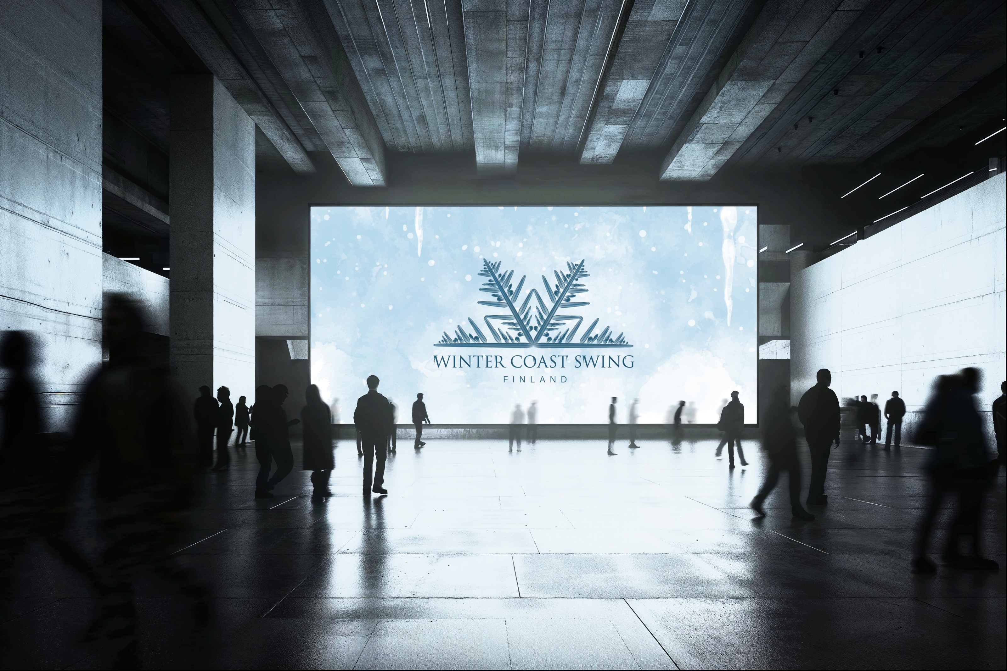
Winter Coast Swing, a WSDC event in Finland, needed a new logo with a set of variations to draw from. The owner had a clear picture in mind: snowflakes, icicles hanging off the lettering, and a display face carrying the weight and drama of an epic fantasy title sequence. The one hard constraint was practical: the blues had to hold up on a dark background and a light one, without a separate version for each.
"The mark shouldn't just say winter. it should look like it was carved out of ice."
The result leans fully into an ice-and-glass character. Frosted edges, icicle detailing, and a blue range chosen so it stays legible against both ends of the background scale. They received three versions: a primary logo for full-size use, a secondary for tighter spaces, and an icon for profile pictures and small applications.
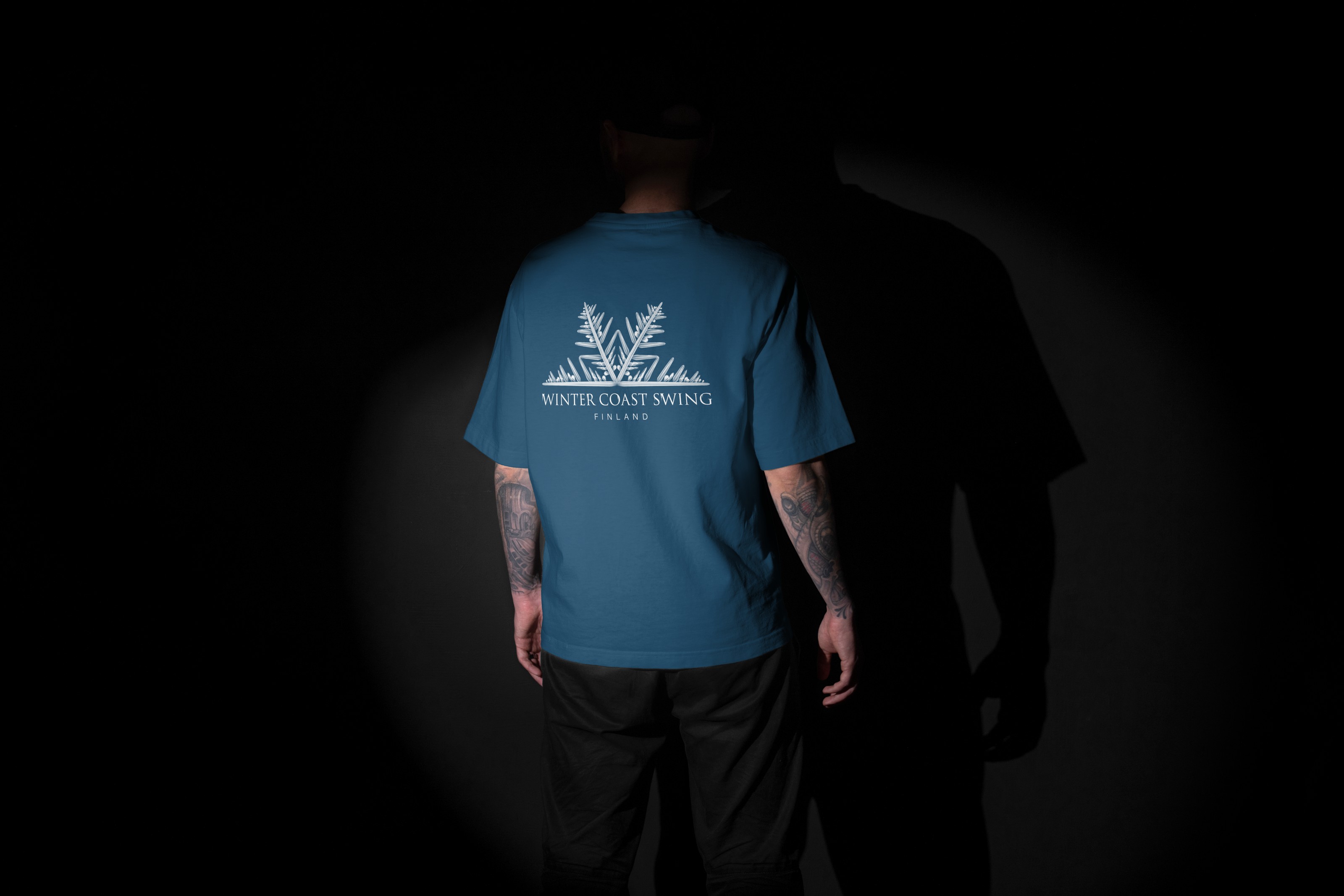 Primary lockup on colour
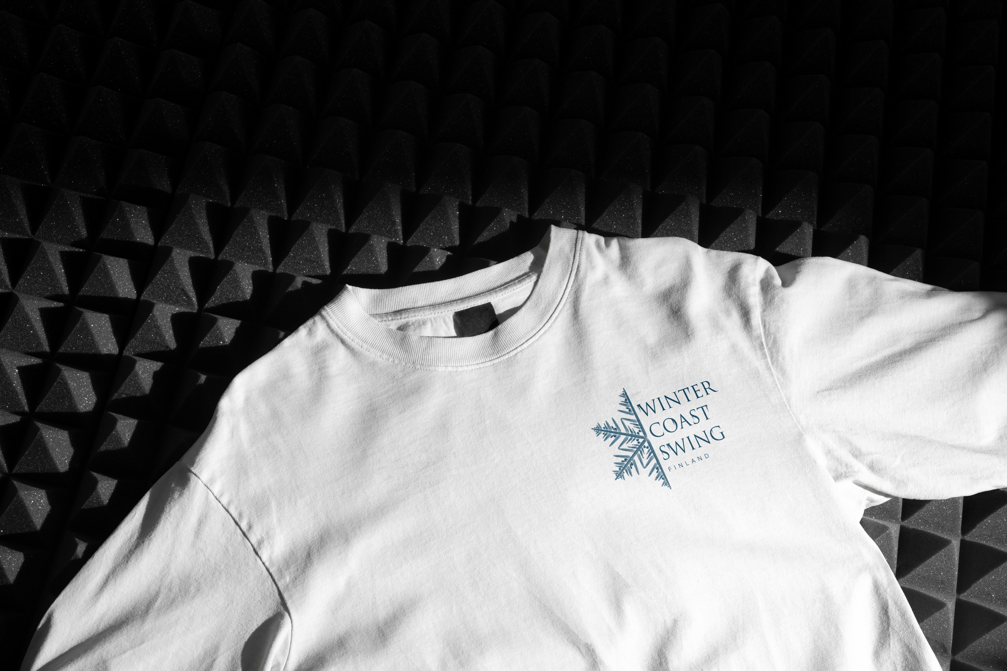 Secondary lockup on light
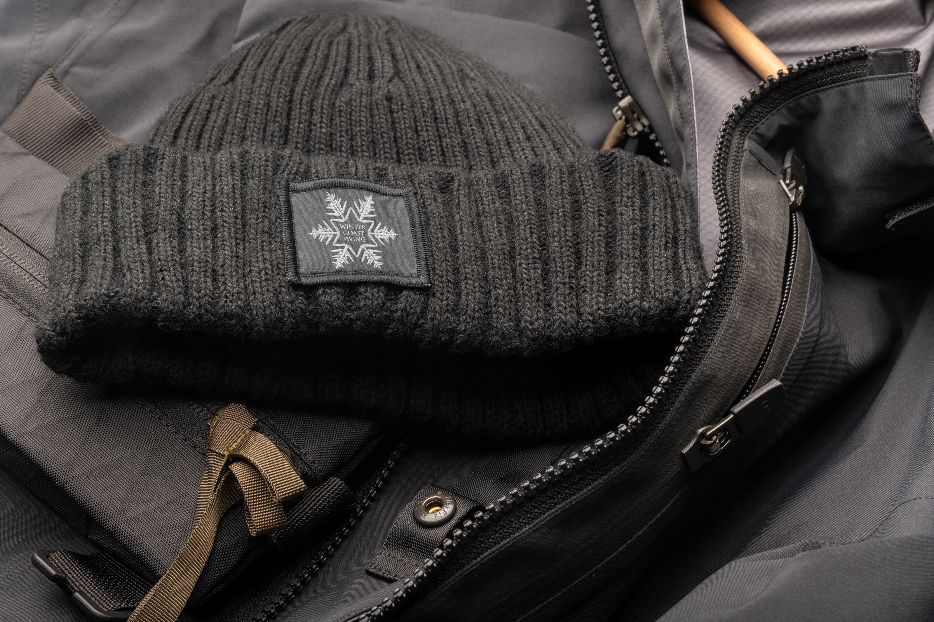 The icon, woven at label size