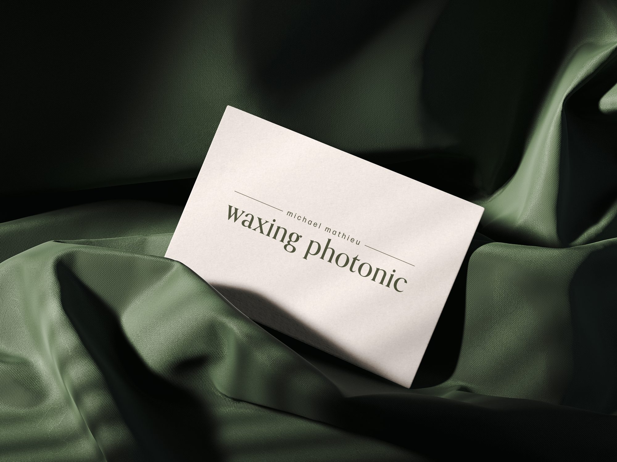
A friend of mine had just started out in photography and needed a wordmark that could carry a brand from day one. Something classic and elegant, but simple enough to hold up at any size, from a business card to a small watermark in the corner of a photo.
"A wordmark only really works if it still reads at ten pixels. elegance has to survive being small."
The result is a serif wordmark built around restraint: clean lines, generous spacing, and no unnecessary flourishes. It's immediately recognisable at full size, and just as legible scaled down to an icon or a watermark.
 Debossed in paper
 The wordmark, on its own