Norwegian Open WCS is my own event. I run it myself, and I create and post everything for it, from social content to on-site materials. It needed an identity that could stand entirely on its own: something that signaled the caliber of the event, worked everywhere I post it, and stayed simple enough for me to keep consistent, week after week, without a team behind it.
"Building a brand from the ground up, for an event I run myself, showed me what proper visual identity actually does in practice. it changes how people perceive the value of what you offer."
The result is an identity built around a small set of fixed rules: one colour palette, one typographic structure, one set of recognisable patterns, from social posts to signage, without having to make new design decisions every time I post.
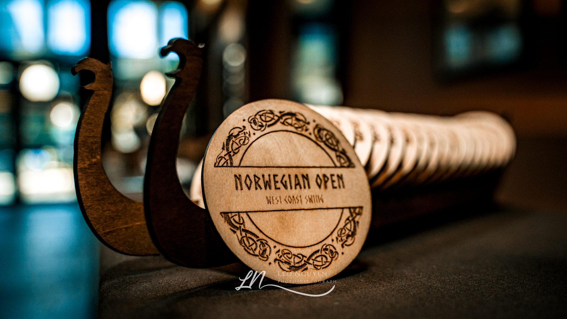 Engraved prizes
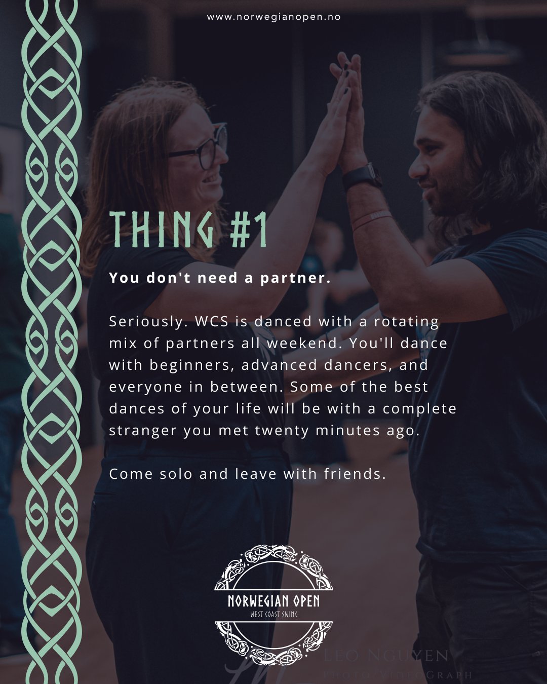 Social content
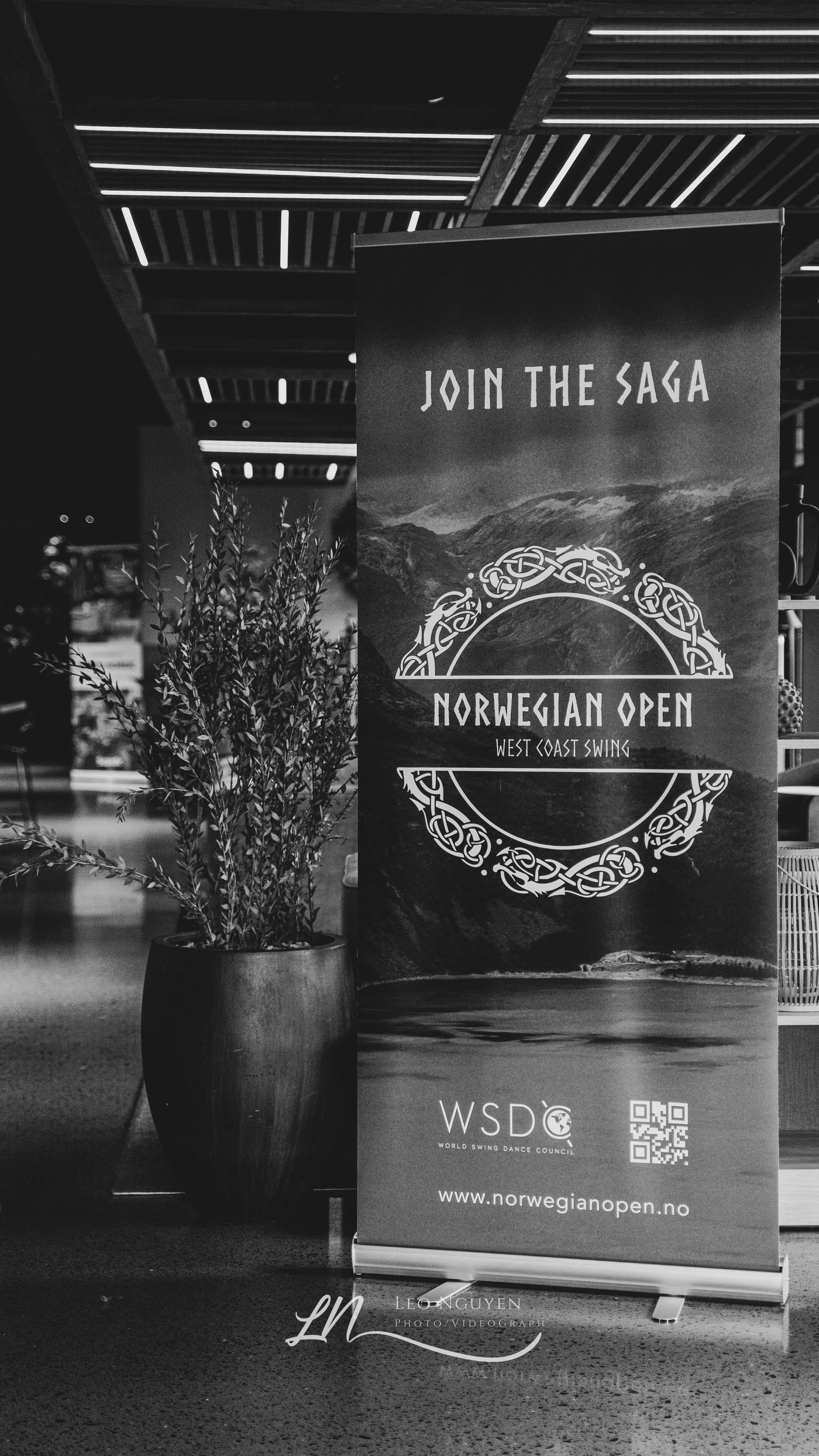 On-site signage